I once worked with a geologist who suggested that planned giving could take some valuable lessons from the field of geomorphology. Both geology and planned giving involve dynamic relationships that change slowly over time and processes that are not readily amenable to experimentation or precise measurement. Both fields are cursed with uncertainty and complexity with long periods of small incremental change punctuated by large-scale events. And geologists and planned giving officers must wrestle with expectations that they should be able to precisely predict events that are stubbornly unpredictable.
Over the years, much has been written about “metrics” for planned giving programs. At first blush, it seems simple: just count the money as it comes in. However, tying results to current activity is more complicated when it comes to planned gifts. Often payment is received only after one or more lifetimes. Donors do not always inform the organization of their generosity in advance. Estate distributions can come as a pleasant surprise, but it’s not at all unusual to find that the catalyst for the gift was actions taken by a planned giving officer decades before. Benchmarking performance to peer organizations is further complicated by significant differences in total dollars raised as well as wide variations in numbers of constituents and the size and consistency of peer fundraising programs.
At the risk of muddying the waters further, let’s explore an approach to tracking variability over time as an indicator of the long-term success and reliability of your planned giving program. This is not to suggest that total dollars received is unimportant. Your mother probably told you, “It’s not the gift that counts,” but she was wrong. Nevertheless, charting year-to-year variations over a period of time provides a useful indicator of the strength of your planned giving program and whether or not it is improving over the long haul.
The first step is to select a concrete measure of productivity. Estimated dollar value of bequest intentions, letters of intent, and pledges are all valid measures for planned giving, but they anticipate future payment and their values are subject to change until actually received. For the purposes of this exercise, we suggest two hard dollar measurements: total receipts from estates and total new contributions to irrevocable life income gifts. These numbers are readily available from your organization’s financial accounting records and, if you want to benchmark, it should be easy enough to gather comparable data from peer institutions.
To get the clearest picture of changes over time, you will need many years’ worth of data. A decade would be a good start but longer is better. Your data may include anomalous events – the Great Recession or the year your organization received a windfall bequest. Noteworthy as these are, the outlier data should still be included for this analysis.
A spreadsheet or table will help you analyze the data. First, calculate the percentage change from year-to-year. Don’t be alarmed if these percentages do not steadily increase every year even though the annual total dollars usually do. We’re looking for the annual rate of change over time, not absolute increases in dollar totals.
If you are benchmarking your program, the annual rate of change (not the dollar amounts) from estates and new life income gifts is a good measure of how you are performing compared to others. A simple line graph can help visualize the rate of change over time and allow you to readily spot the banner years and the disappointing years. This variability is to be expected because, unlike pledge payments resulting from a capital campaign, the timing of planned gift receipts is more random. Plotting a trendline on the graph will help highlight what is going on. If the trendline slopes downward, that indicates revenue has become less variable over time, suggesting that your program is becoming more predictable and reliable – more stable. If that trendline slopes upward, your program is experiencing large amounts of variability and is less predictable. Here’s an example:
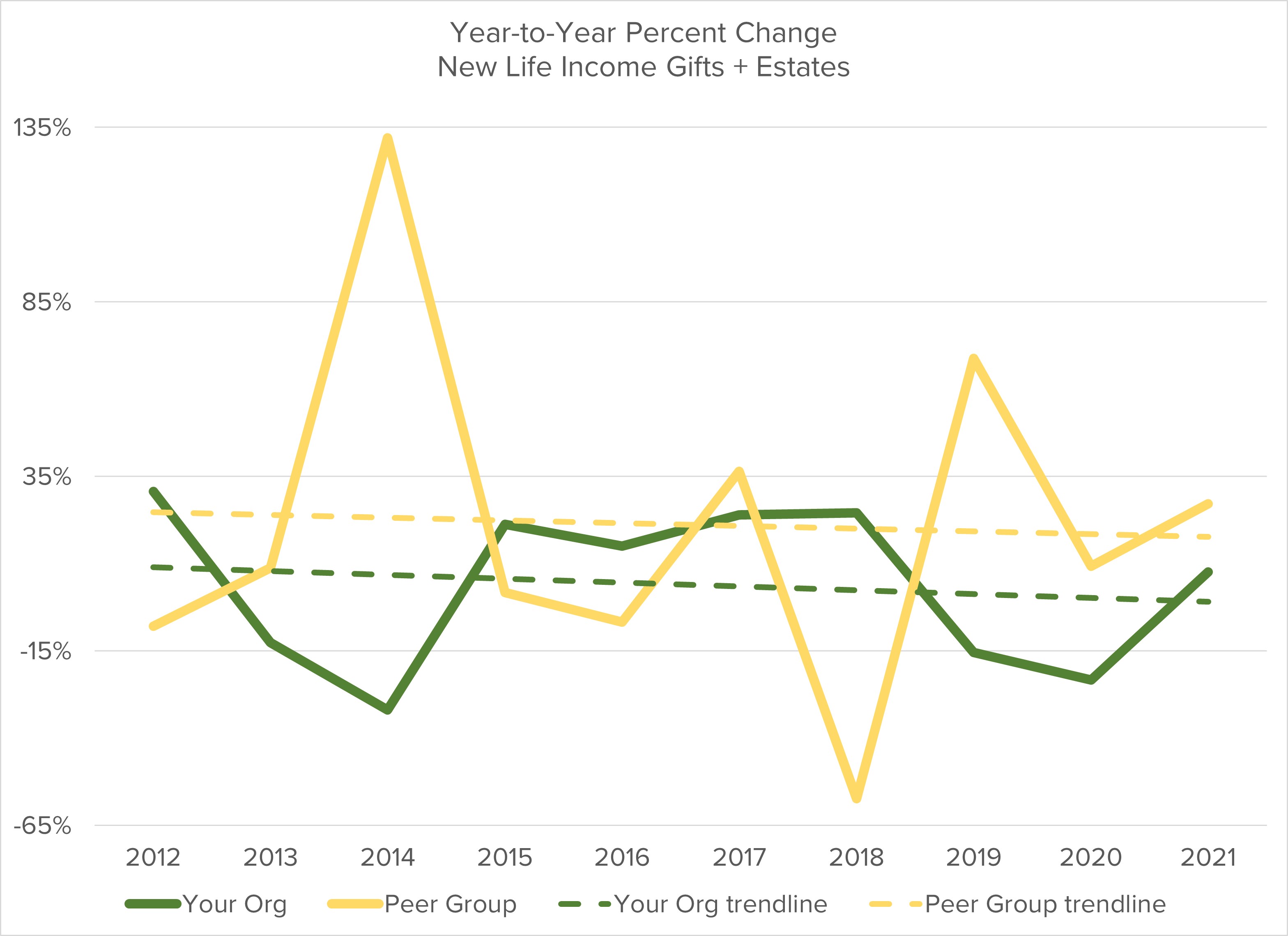
If you choose to collect peer data, it can be elucidating to graph your peers alongside your organization. If there are significant differences, it can be an opportunity to dig deeper. Are these differences normal variations? Or do they indicate opportunities to explore ways to more consistently apply planned giving fundraising or perhaps suggest novel approaches you could adapt?
Finally, a standard deviation calculation can provide yet another glimpse of the variability of your program, especially compared to your peers. If you don’t remember your statistics class, standard deviation measures how tightly data are clustered around the average. Essentially, one standard deviation is the amount above or below the average within which about two-thirds of the results fall. If the standard deviation of your organization’s annual change is, let’s say, 2% and your average annual change is 5%, then two times out of three you would expect next year’s change to be between 3% and 7%.
There is a welter of measurements applicable to planned giving. Your organization’s financial statements are governed by FASB or GAAP standards. The CASE Global Reporting Standards provide guidelines for recognition of contributions. The National Standards for Gift Planning Success issued by the National Association of Charitable Gift Planners suggest program best practices. Measuring annual change over time provides an additional tool that can provide clues as to the long-term growth and stability of your planned giving program.